I’m revamping my illustration portfolio! One day, after 2 decades of indecision, I woke up and just decided to pick the easiest way of making images and sticking with it until I had a whole portfolio. The aim is to decrease indecision, second guessing, and analysis paralysis and to just get things made.
Spoiler: the second guessing has NOT gone away. It is just as powerful as before.
BUT I’m just going to continue regardless. (I’ll write later about second guessing in the future)
My aim is to get work in picture book and middle grade illustration. I’m focusing on middle grade right now and I made myself a list of my favorite middle grade books to illustrate as if I was hired to do the job.
Today I want to walk you through the process of remaking an older piece I actually really like. Did I make a piece that was as good or better? Did I actually end up making something worse? Let’s see!
The Halloween Tree by Ray Bradbury is one of my favorite books. I love the descriptive way Ray Bradbury writes and I LOVE halloween. This book gives me creepy, spooky vibes without anything actually scary happening. It is a playful romp through the themes and symbolism surrounding Halloween without any jumpscares or usual gimmicks of “spooky” books.
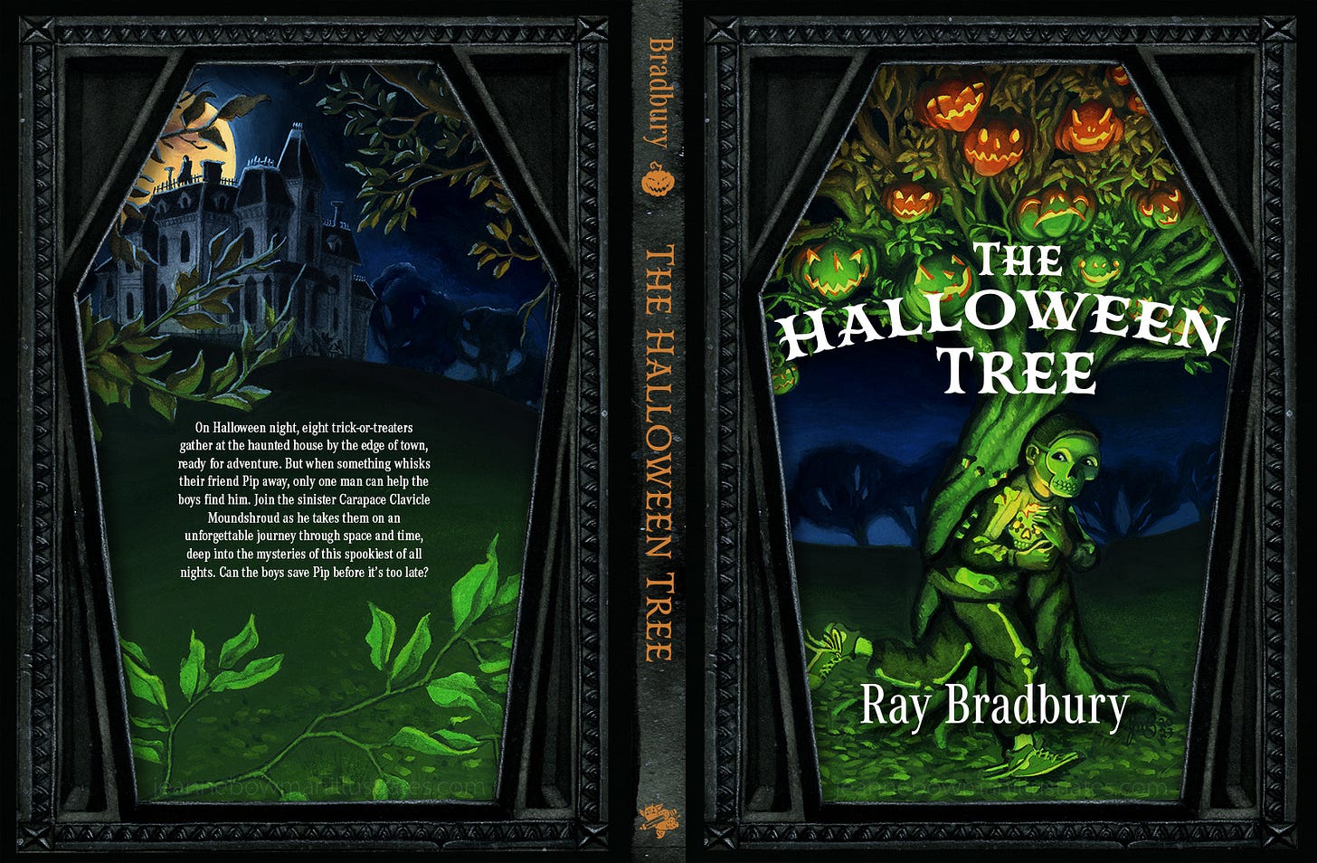
This was my first attempt of re-making this cover. I actually quite like this piece, and the process of painting it was slow as heck but fun. I painted it in watercolor and gouache over several weeks.
What I like: I LOVE dark paintings with saturated pops of color. Carvaggio, Rembrandt, Mike Mignola, Dave McKean, Clive Hicks Jenkins- these are some of my favorite artists precisely because they pair the dark and light together in the most wonderful way. (Yes, my favorite level in Psychonauts WAS the Black Velvetopia level. How did you know?)
I personally like the symbolism I was trying to achieve here, with Tom cradling a broken sugar skull. I really like the over-jacket with the coffin shape. I feel like it pulls from the book in a good way without giving it all away.
I’m also going to give myself kudos for painting all these details. I think I did a pretty good job on the light transition over the forms of the pumpkins and tree branches.
What doesn’t work: Working on my previous picture book illustration projects, I am learning that all that black ink on a page can totally swamp the artwork, sometimes losing detail. Of course, there are lots of artists who reproduce dark work but it is apparently a really tricky balance that I haven’t figure out yet. So I’m beginning to be leery of making anything too dark unless it is colored simply like a Hellboy comic or something.
My character is really quite small and a lot of the detail is lost when it is reduced to the size of a paperback book. (I painted it twice the size so I could put in all the detail.) The lighting was meant to be eerie and weird but the color is kinda funny with the transition from green to white light so the pumpkins could show their true colors. I probably should have made them all green or something. Also, the little teeny figure of Moundshroud on the top of the mansion is totally lost. I should not have put him in there at all. I’m still learning to edit.
So now lets see the revised version:
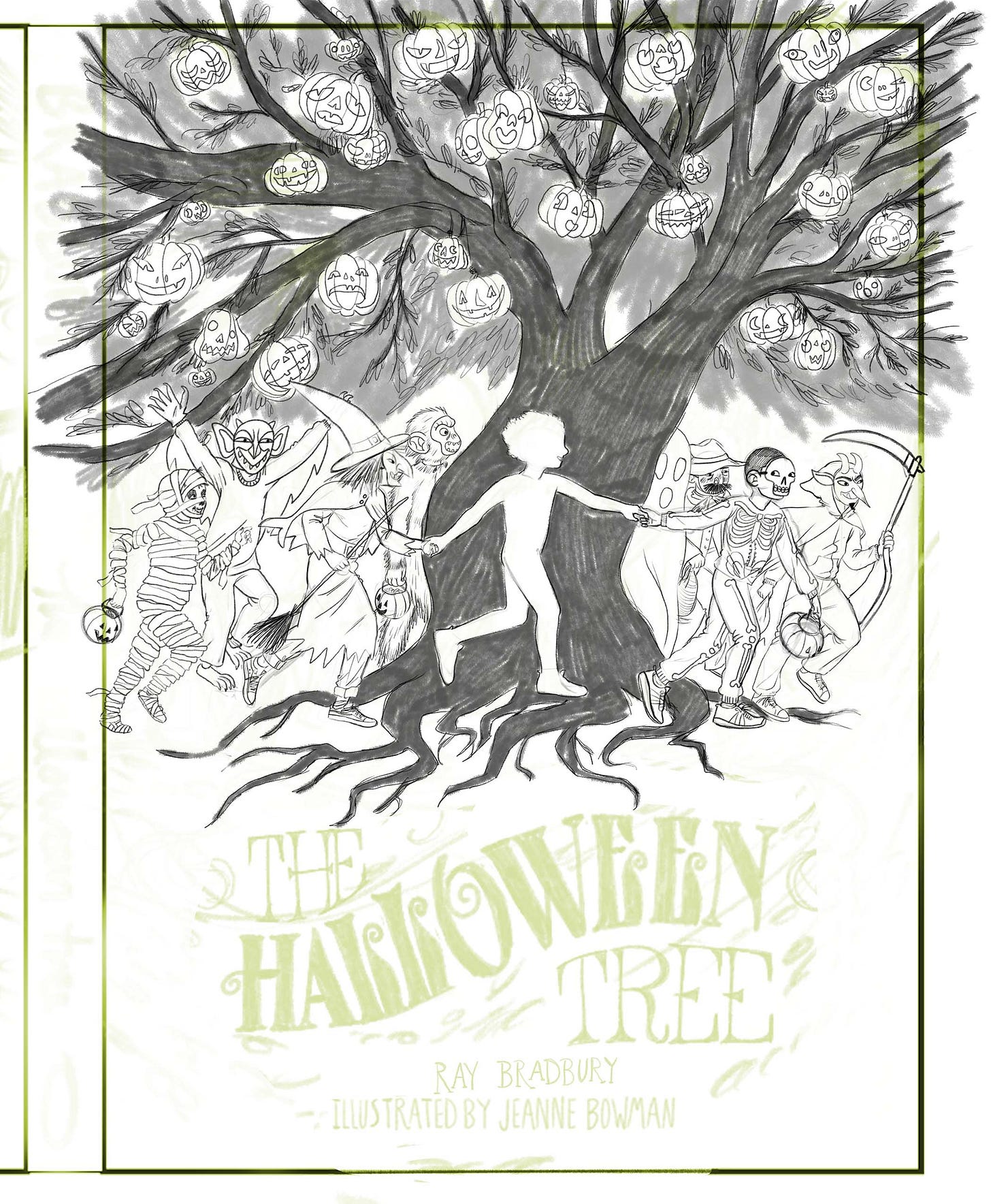
First the sketch: (the one on the left)
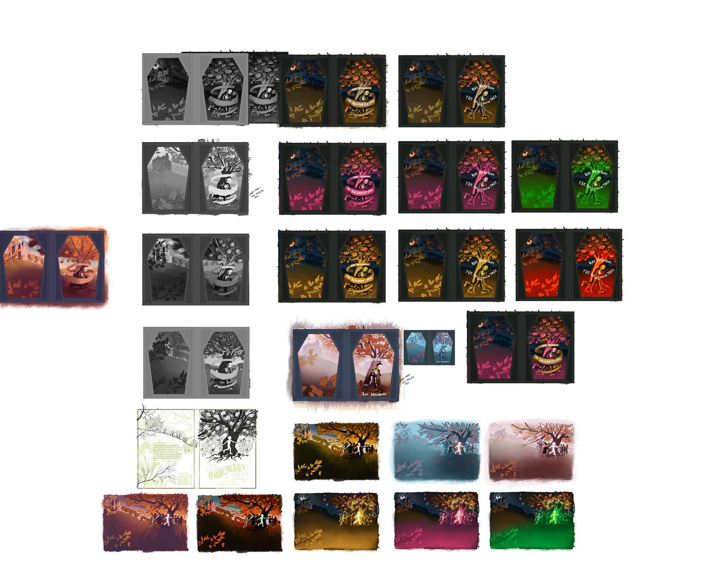
I had actually designed this cover at the same time I worked on the previous cover, but stopped at the color stage. It was nice to be able to pick it up again when I decided to go in a different direction and have a lot of the work done for me already. Perhaps this is something to implement in the future?
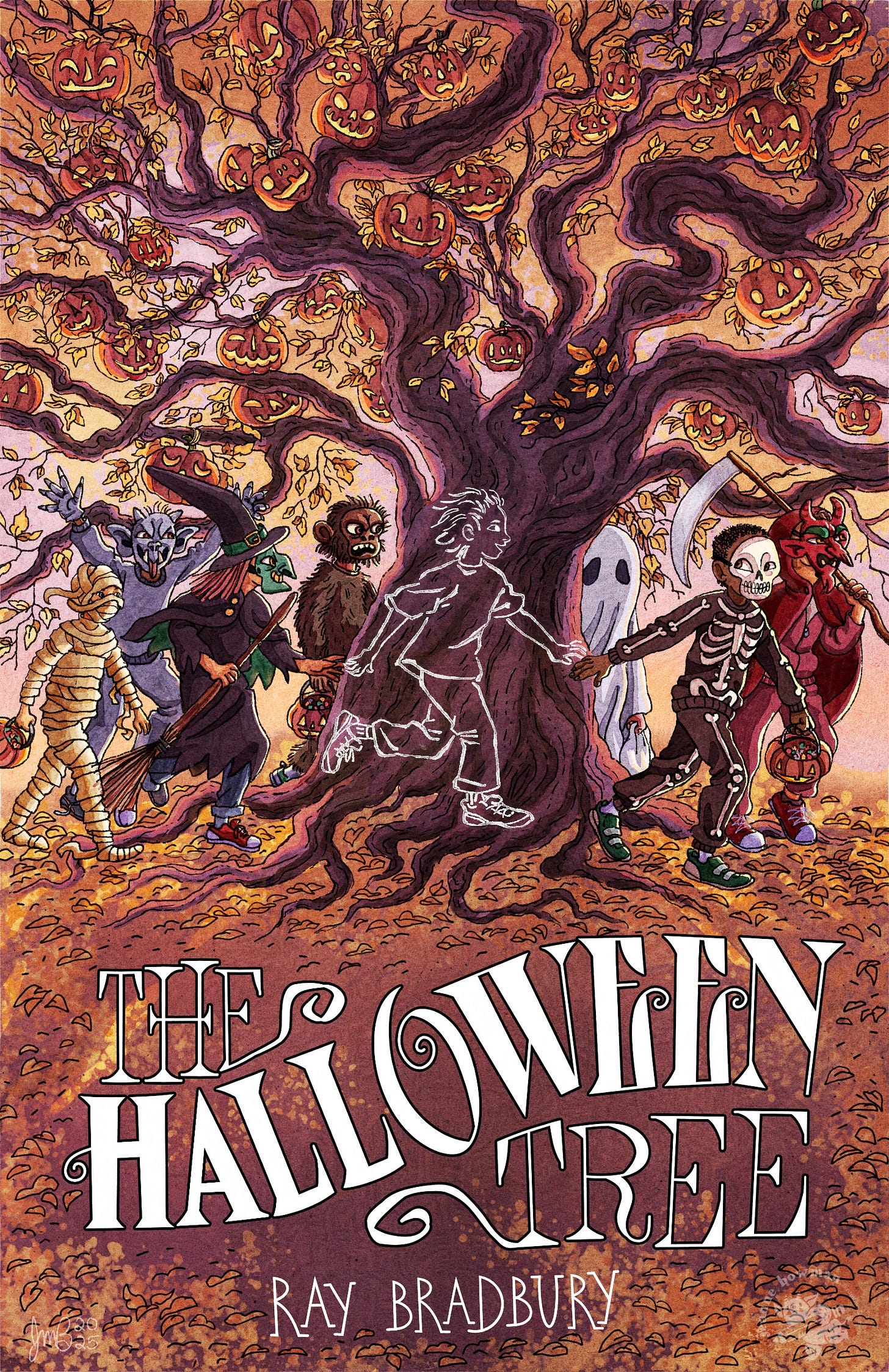
The finished piece:
What do you think? Is it any better? Has it lost the creepy vibe? Does it look like it fits in with other middle grade books? I’d love to hear your thoughts about this in the comments if you wouldn’t mind giving me a grade!
What I chose to do differently: In this version, I wanted to make the whole point of the book a little more obvious. This is what I loved as a kid when I looked at book covers. There were always all kinds of things that decorated the covers that you didn’t learn about until after you read the book, and it was like unlocking a puzzle as you read. So I wanted to make the missing Pipkin front and center.
I also wanted to focus on the other characters. While Tom is arguably the main character, there isn’t a true focus on him and his motivations as there are for characters in other books. There isn’t much depth to any of these characters, really. They are stand in figures for the reader as Moundshroud takes the reader through “a history of Halloween” (quotes because I’m not sure how much of it is actually historical). Each character in their costume represents a different time period in the history of Halloween and the fear of death. Some get whole chapters, like the gargoyle and witch and mummy, while the ghost and beggar and ape man get little paragraphs.
Truthfully, I just wanted to paint costumes.
I also went with a totally different color scheme- focusing on the traditional orange of halloween.
What I like: Well, you can certainly see more detail! I still have a problem with making things too small and too detailed, but I feel like the simplified line style and the lighter color palette makes it a little more readable (Hopefully? Correct me if I’m wrong). I also really like the mask from the witch and the ape man and the skeleton.
What doesn’t work: The type is my first attempt at handlettering. I will be fixing that in the future (after I’ve made the other pieces and can circle back to make fixes). There are inconsistencies and wonkiness in the letters and the rise in “halloween” might need to be eliminated. As for the illustration: I keep doing this lighting scheme that is focused on backlighting and it always makes things darker and more confusing than they should be. I should probably repaint it with the light facing the front. What do you think about it? Does it work? I also wonder if I need more depth in the tree. I also might back off the color later to make it a little lighter. I’m not sure if it is due to the paper overlays I’ve got on there but it still looks too dark and sort of crunchy to me in spots.
So there you have it, the first attempt in my middle grade portfolio in this new style I’ve chosen. If you wanna see the process of painting it, I’ve got a time lapse for you here, hot off the oven! (No sound. Do you like sound in your timelapses? Please let me know!)
Thanks as always for reading and if you don’t mind leaving me a comment about what you think about this piece that would be SUPER rad. I’d don’t have a dedicated critique group right now so feedback is welcome!


Wow, Jeanne! You never cease to amaze. The lighter color palette allows for an easier read on the smaller details you’ve incorporated in the cover. The hand lettering has personality and an authenticity about it that would be missing with a dedicated font. Keep up the great work.
I'm so impressed, Jeanne!! I love the timelapse, sound or no sound. I think you've created a cover that pops and kids who like spooky books would pull off a shelf! I personally really love your hand lettering--it really speaks volumes in and of itself! Great job and going back to older pieces and never giving up. You're encouraging!