

The Secret of Platform 13
How I made a mock book cover

I really, really, really, want to work on Middle Grade Books! It was these kind of books that got me excited about art as a teenager, and I want to return to them. Today, I’ll walk you through the process of making a mock cover for The Secret of Platform 13 by Eva Ibbotson. We will talk about what I learned throughout the process (including a brain shaking revelation about color!) and I’ll point you to some great resources if you are taking on an illustration project like this for yourself.
First, to work on these MG’s in a manageable way, I break them down into a spreadsheet that tells me a summary of what happens in each chapter, in which chapter characters are introduced, and what they are described to look like. This way I don’t have to flip constantly through the book looking for descriptions.

This is something I learned from Jessica Vitalis in the “Building Blocks of Story” workshop she gave at the Billings Public Library earlier this spring. I’m not using her method exactly, but I liked having everything at a glance.
Next- the sketches!
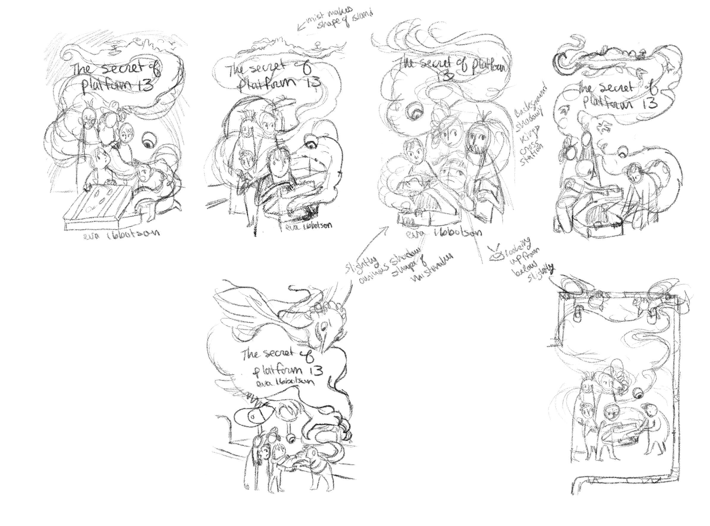
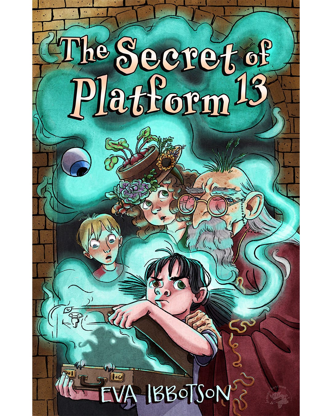
The characters are what draw you into this story, so I wanted to have them front and center in this version of the cover.
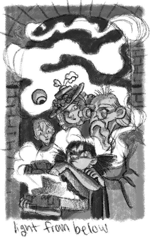
This is the version I decided to go with, but as you see in the following time lapse video, the actual coloring and value had to shift a lot.
I can do a single source, one color light scenario easily, but when I wanted to add a second light from above, it threw me off. Every study I started ended up in the trash. I had to completely stop what I was doing and renew my knowledge about color and light. For that, I recommend these amazing videos by Marco Bucci:
Painting Skin Tones and How Light Affects Color
The Power of Light on Skin Color
To summarize the videos: to “meet” two colors opposite on the color wheel you have to “move” them through the grays. The grays, which have features of each color, will harmonize the colors no matter how opposite they are. So this means that my desire to paint a warm colored light coming in from above and a cool light coming from the mist could work as long as I controlled the neutrals in between the two colors. Once I figured that out I attempted two color studies and then I was off to the races!
I also want to mention how important feedback is. After I posted an earlier version of this piece, my friend Jensen Collins, a wonderful illustrator herself, gave me some notes on how to make the type pop forward on the cover more. Thank you Jensen!
So there we are- a new cover. Will it attract Art Directors? I’ll let you know!
As always, thank you for reading!!
Okay, I seriously love the music with the time lapse. But even more so--I love your artistic skill in this cover! Way to make it pop!!